Nothing Leans Into Industrialism with Phone 4b: Blue Finish and a New ‘Glyph Bar’ Revealed
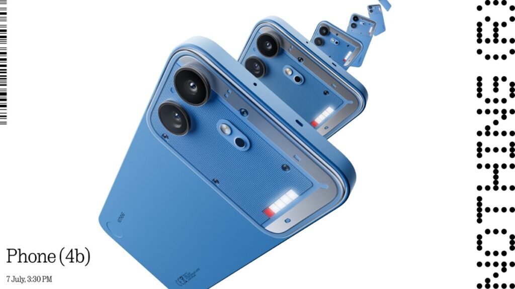
Table of Contents
A Departure from the Segmented Glyph
Nothing has spent the last few years carving out a visual identity based on transparency and skeletal lighting, but the newly revealed Phone 4b suggests the company is moving toward a more consolidated design language. In an official reveal on Thursday, the London-based startup showcased the Phone 4b, the latest entry in a diversifying Phone 4 family that already includes the 4a and 4a Pro models.
The most striking shift is the abandonment of the wide, segmented Glyph Interface that defined previous generations. In its place, Nothing has introduced a “Glyph Bar”—a compact, horizontal lighting element situated just below the camera island. This suggests a pivot from the Phone 4b being a “showpiece” of lighting to a more functional tool where LEDs are used for targeted notifications, charging progress, and specific app-driven alerts without the visual noise of a full-back array.
The Blue Aesthetic and Unibody Construction
While Nothing typically sticks to a monochrome palette of whites, blacks, and greys, the Phone 4b introduces a bold blue colorway. This isn’t a simple paint job; the hue is integrated into the transparent rear panel, which continues to expose the device’s internal architecture. The design maintains the brand’s obsession with industrialism, featuring visible screws and a textured central panel that creates a layered, mechanical look.
Structurally, the Phone 4b adopts the refined unibody construction first seen in the Phone 4a Pro. By moving away from the more fragmented assembly of early models, Nothing is attempting to bridge the gap between its “experimental” image and the build quality expected of a premium mid-to-high-range handset. The result is a chassis that feels more cohesive while still adhering to the company’s ethos of making technology visible.
Positioning Within the Phone 4 Ecosystem
The introduction of the 4b creates an interesting hierarchy within the current lineup. With the 4a serving as the entry point and the 4a Pro targeting power users, the 4b appears to be positioned as the “style-forward” alternative. By borrowing elements from the Pro model but simplifying the lighting interface, Nothing seems to be targeting a demographic that appreciates the aesthetic of the brand but finds the extensive Glyph patterns of previous models too distracting or gimmicky.
Industry analysts note that this move reflects a broader trend in the smartphone market where “design-first” companies must eventually pivot toward refined ergonomics to maintain long-term growth. The Phone 4b isn’t just a new color; it is a litmus test for whether Nothing’s audience prefers a more disciplined approach to transparency.