Microsoft Strips the Flare from Copilot in a Pivot Toward ‘Invisible’ AI
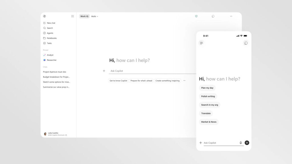
Table of Contents
The Shift Toward Low-Friction Intelligence
Microsoft is quietly stripping the personality out of Copilot. In a new visual overhaul targeting the Microsoft 365 ecosystem, the company is moving away from the vibrant, almost playful aesthetics of its early AI rollout in favor of a stark, text-forward interface that feels more like a professional tool and less like a chatbot mascot.
The redesign, currently rolling out across Word, PowerPoint, and Excel, represents a fundamental shift in how Microsoft views the role of generative AI in the workplace. While the initial launch of Copilot was marked by colorful gradients and a sense of “AI novelty,” the new look is largely monochromatic. According to Microsoft, the goal is to craft an intelligence that feels “present but not imposing.”
This pivot suggests a realization that for power users spending eight hours a day in a spreadsheet or a slide deck, a flashy AI interface isn’t a feature—it’s a distraction. By neutralizing the color palette, Microsoft is attempting to blend Copilot into the background of the operating system and the productivity suite, treating the AI as a utility rather than a standalone product.
Dynamic Surfaces and Contextual UI
Beyond the aesthetics, the functional architecture of Copilot is changing. The most significant update is the introduction of a “prompt surface.” Unlike the static text boxes of previous iterations, this new input area is dynamic; it expands and reveals specific functions based on the intent of the user’s typing.
If a user enters a simple text query, the box remains streamlined. However, once the AI detects a request for complex research or data visualization, the interface “unfurls” to reveal menus for file selection or specific visual guidance tools. This contextual behavior is paired with new collapsible side panels, ensuring that the AI only occupies screen real estate when it is actively providing value.
This consistency extends across the entire M365 suite. Whether you are drafting a memo in Word or analyzing a pivot table in Excel, Copilot now resides in a standardized side pane, mirroring the behavior of the standalone Copilot app. This removes the cognitive load of relearning where the AI “lives” as users jump between different software environments.
A Fragmented AI Strategy
Despite the push for consistency within M365, Microsoft’s broader AI identity remains fragmented. There is currently a visible divide between the “buttoned-up” corporate version of Copilot and the consumer-facing version found in mobile apps and Windows 11. The latter retains the bright, colorful, and occasionally “blobby” design language that characterized the 2024 launch.
This duality reflects a deeper tension within Microsoft’s current strategy. On one hand, the company is aggressively integrating AI into every corner of the Windows experience; on the other, it has recently begun pulling Copilot out of certain apps following user backlash over intrusive placements.
Furthermore, the backend is shifting as much as the frontend. While the partnership with OpenAI remains a cornerstone, Microsoft is increasingly diversifying its model dependencies, rolling out more in-house models and diversifying its investments. This suggests that the visual redesign is more than just a coat of paint—it is part of a larger effort to stabilize an AI ecosystem that has felt, at times, like it was being built while the plane was already in the air.
For now, the minimalist look is reserved for the productivity suite, but it serves as a signal: Microsoft is moving past the “wow factor” phase of AI and into the era of invisible integration.