Decoding the Crescent: The Evolution of iPhone’s Do Not Disturb and the Shift Toward AI-Driven Focus
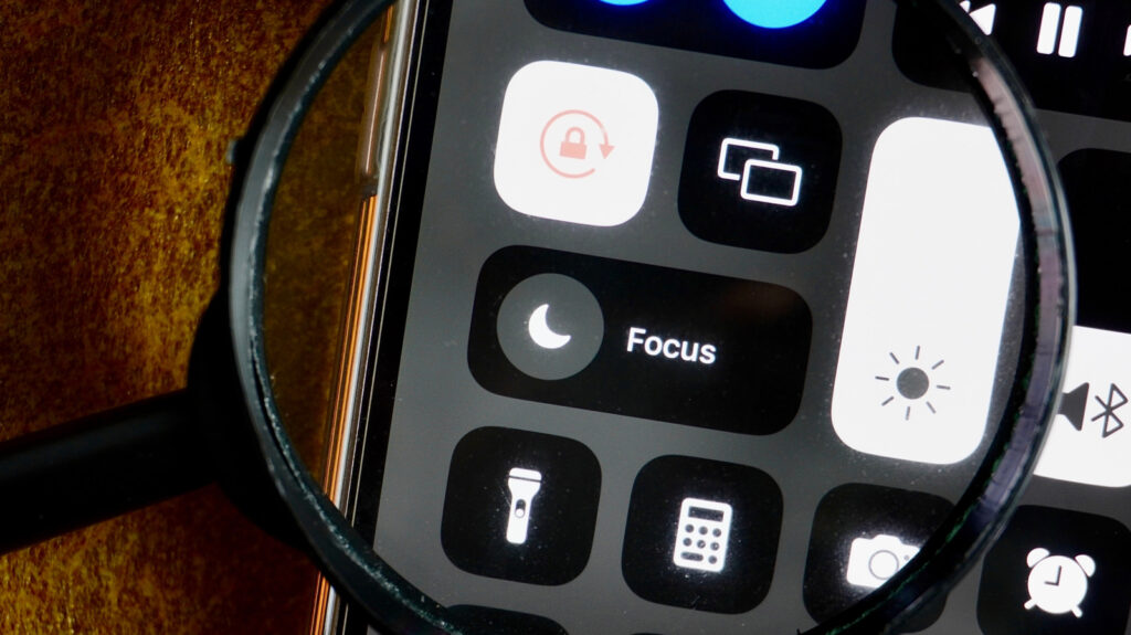
Table of Contents
More Than Just a Moon: A Legacy of Silence
For the uninitiated, the small crescent moon appearing in the iPhone’s status bar can be a point of confusion. For longtime users, it is a visual shorthand for peace and quiet. Officially termed the Do Not Disturb icon, the symbol has remained one of the most consistent pieces of UI in Apple’s ecosystem since its debut in 2012 with the release of iOS 6.
Before this implementation, silencing an iPhone was a binary affair handled by the physical mute switch. While the switch killed the ringer, the haptic motor continued to vibrate with every incoming alert. The introduction of Do Not Disturb shifted the paradigm from merely silencing the device to actively filtering the flow of information. It allowed users to carve out blocks of time—primarily for sleep—where only a curated list of ‘Favorites’ could break through the silence.
The choice of the crescent moon was an intuitive play on the concept of nighttime. While Apple has never released a formal design manifesto explaining the choice, the symbolism is clear: the moon represents the hours when the world slows down and the user requires undisturbed rest. Even as the feature evolved to be used during work hours or in classrooms, the icon stuck, becoming an ingrained part of the iOS visual language.
From Simple Silence to Complex ‘Focus’
The real architectural shift occurred in 2021 with the launch of iOS 15. Apple recognized that “silence” isn’t a one-size-fits-all requirement. A user’s need for quiet while at the gym is fundamentally different from their need for quiet during a corporate board meeting. This led to the birth of Focus modes.
Focus modes expanded the original Do Not Disturb logic into a series of customizable profiles—Work, Sleep, and Travel being the primary presets. These profiles allow for granular control over which apps can send notifications and which people can reach you, depending on the context of your day. While the original Do Not Disturb mode retained the crescent moon for continuity, Apple finally allowed users to move beyond the moon by assigning custom colors and icons to their own unique Focus profiles.
Integration has only deepened with later iterations. iOS 16 and iOS 18 shifted Focus from a simple toggle to a systemic state. Users can now link specific Lock Screen wallpapers to individual Focus modes. Switching your wallpaper doesn’t just change the aesthetic; it triggers a systemic change in how your device behaves, automatically updating your notification filters and home screen layouts to match your current activity.
The Intelligence Era: Beyond Static Rules
The most significant leap in this trajectory is the arrival of Apple Intelligence in iOS 18. For years, Focus modes relied on static rules: if Person A is on the ‘Allowed’ list, the notification gets through. But real-world urgency is rarely that linear.
Enter the Reduce Interruptions Focus mode. Unlike its predecessors, this mode leverages on-device machine learning to analyze the content of an incoming notification. Rather than relying on a pre-approved list of contacts, the AI assesses whether a message is truly urgent or merely routine. If a text says “I’m outside and the door is locked,” the AI recognizes the immediate nature of the request and allows it to bypass the filter, even if the sender isn’t in a priority group.
This shift replaces the simple ‘on/off’ logic of the crescent moon with a dynamic filter. Interestingly, this AI-driven mode eschews the customizable icons of standard Focus modes in favor of the Apple Intelligence glyph, signaling a new era where the device decides what constitutes a distraction. As Apple continues to sync these states across the Apple Watch, iPad, and Mac, the crescent moon stands as a reminder of where the journey began: a simple request for a little bit of quiet in a noisy digital world.