Android 17 QPR1 Beta 3 Shifts Focus Toward ‘Glassmorphism’ and UI Fluidity
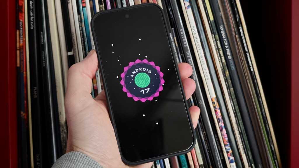
Table of Contents
Google is polishing the edges of the Android 17 experience
While the broader industry is still digesting the announcements from Google I/O, the company has quietly pushed Android 17 QPR1 Beta 3 to enrolled testers. For the uninitiated, QPR (Quarterly Platform Release) updates are where Google typically fine-tunes the OS and sneaks in feature additions that didn’t make the initial stable cut. This particular beta serves as the architectural foundation for the substantial Pixel Feature Drop expected in September.
The release is currently available for users within the Android Beta Program, spanning the hardware range from the aging Pixel 6 series up to the latest Pixel 10 devices. While the changelog is heavy on the usual stability patches, the actual user experience reveals a calculated shift in Google’s design philosophy: a move toward deeper layers of transparency and a more tactile, physics-based interface.
The ‘Blur’ Era: A visual departure
If Android 12 was about the bold colors of Material You, Android 17 appears to be about depth. In Beta 3, Google has leaned heavily into background blur effects, creating a visual style reminiscent of ‘glassmorphism.’ This isn’t just a superficial filter; it’s being integrated into how the OS handles transitions and overlays.
One of the more distinct changes is the revamped camera launch sequence. When triggering the camera via a double-press of the power button, the UI no longer simply ‘appears.’ Instead, the Camera app expands dynamically from the side of the frame, visually pushing away the lock screen’s overlay. It’s a subtle change, but it creates a sense of spatial continuity that has been missing from previous iterations.
This physics-driven approach extends to the Quick Settings menu. Testers have noted a new ‘bouncy’ animation when pulling down the notification shade. The menu now springs back slightly upon release, giving the interface a more organic, less rigid feel that aligns with the fluid animations seen in competing high-end skins like iOS or OxygenOS.
Functional shifts in Quick Settings and Media
Beyond the aesthetics, Google is rethinking how users interact with multitasking and media controls. The media player card within the Quick Settings menu has been completely overhauled. Moving away from the traditional swipe-to-switch mechanic, the new card layout utilizes a tap-based system to navigate between different media apps. This change suggests Google is trying to reduce the friction of managing multiple audio streams, though whether tapping is objectively faster than swiping remains a point of contention among early testers.
The screen recording utility has also received a quality-of-life update. The menu now remembers the last used application by default, reducing the number of taps required to start a capture. Additionally, the toggles for device audio and microphone access have been streamlined for quicker access, acknowledging the growing trend of users creating short-form social content directly on their devices.
Addressing the stability gap
Of course, it is a beta, and the release notes are dominated by the reality of software in flux. Google has addressed several critical regressions that plagued Beta 2, most notably the erratic Wi-Fi disconnections and distorted audio during high-bitrate media playback.
The update also targets UI glitches that occurred when apps transitioned to full-screen mode and a frustrating bug where Home Screen widgets would spontaneously disappear after a reboot. These fixes are essential for the build to be considered ‘stable’ enough for the wider public release coming in the next few weeks.
For those currently on the stable build of Android 16 or early Android 17 previews, this QPR1 cycle represents the bridge to the autumn Feature Drop. While no single ‘killer feature’ has emerged, the cumulative effect of these UI refinements suggests that Google is prioritizing the *feel* of the software as much as the functionality.