Android 17 QPR1 Beta 3 pushes a ‘blur-first’ aesthetic and refined animations
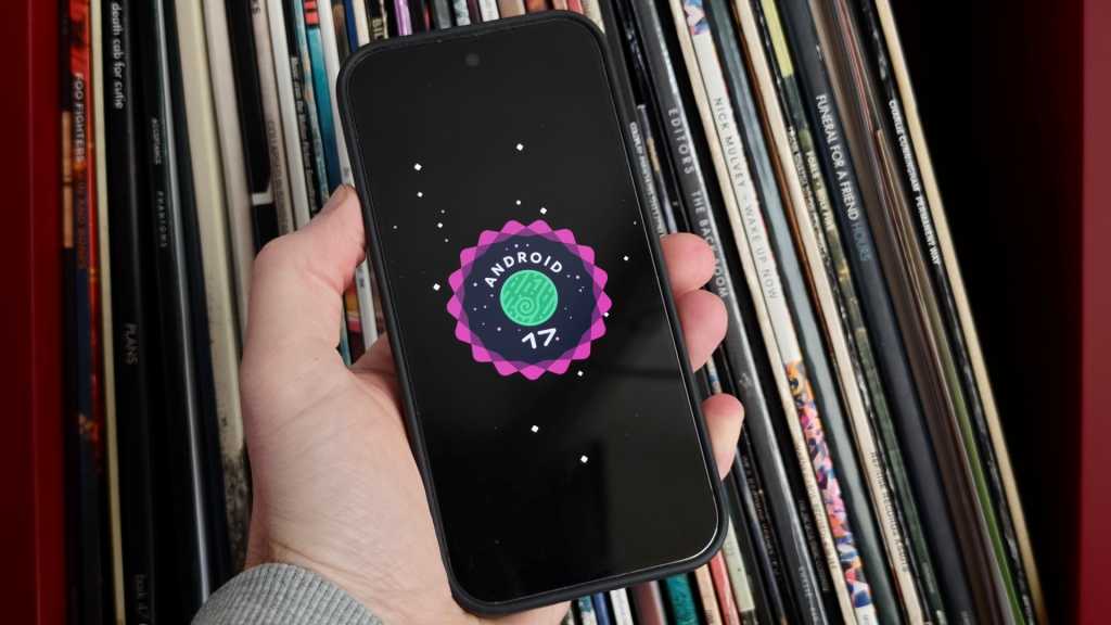
Table of Contents
Beyond the bug fixes: Google’s visual pivot
While Google I/O is typically defined by sweeping AI announcements and hardware reveals, the software side of the house is currently preoccupied with a very specific kind of polish. The rollout of Android 17 QPR1 Beta 3 marks a shift in focus from core architectural changes to the ‘feel’ of the OS—specifically how it moves and how it handles depth.
For those tracking the release cycle, the timing is strategic. With the first stable build of Android 17 expected to hit devices in the coming month, Google is already sprinting through the QPR1 (Quarterly Platform Release) cycle. This particular beta is essentially the blueprint for the substantial Pixel Drop scheduled for September, meaning the features seen here are likely the final candidates for a wide rollout.
The ‘Bouncy’ UI and animation overhaul
The most immediate change in Beta 3 is the introduction of a more organic, physics-based animation system. The Quick Settings menu now features a ‘bouncy’ effect; rather than a static slide-down, the menu exhibits a subtle spring-back motion when pulled, giving the interface a tactile quality that aligns with the trend toward ‘fluid’ design seen in competing mobile OS ecosystems.
This attention to detail extends to the camera launch. By double-pressing the power button, users will notice the Camera UI expanding from the side of the device, effectively pushing away the lock screen overlay. It is a small change, but it removes the jarring transition between the locked state and the lens, making the capture process feel more integrated into the hardware’s physical orientation.
A commitment to background blur
If there is a single design keyword for Android 17, it is blur. Google is leaning heavily into Gaussian blur and translucent overlays to create a sense of hierarchy and depth. In Beta 3, this effect has been intensified across various system overlays, reducing the reliance on solid colors and harsh borders to separate foreground and background elements.
This design philosophy is most evident in the revamped media player controls within the Quick Settings menu. Google has ditched the traditional swiping mechanism for switching between media apps in favor of a card-based layout. Users now tap to toggle between active media sessions, a move that reduces accidental swipes and provides a clearer visual snapshot of what is currently playing across different apps.
Stability and utility refinements
Beyond the aesthetics, Beta 3 addresses several friction points in the user experience. The screen recording utility has received a logical update: it now defaults to the last used app, removing a repetitive step for creators. Additionally, the recording menu now features more prominent toggles for microphone and device audio, streamlining the setup for quick captures.
On the stability front, the release notes highlight fixes for several high-visibility bugs. These include intermittent Wi-Fi disconnections, audio distortion during media playback, and a recurring glitch where Home Screen widgets would spontaneously disappear. While these aren’t ‘headline’ features, they are critical for a beta that is meant to transition toward a stable public release.
The beta is currently available to those enrolled in the Android Beta Program and is compatible with Pixel devices ranging from the Pixel 6 series up to the current Pixel 10 lineup. As Google moves toward the September Pixel Drop, the focus will likely shift from these aesthetic tweaks back to the underlying stability of the QPR1 branch.